
Working with Curves Adjustment Layers and Masks
This is the last post in a three-part series about what I first half-jokingly called my Intuitive Localized Contrast Control technique, or ILCC for short (here are links to Part 1 and Part 2). Everyone has their fancy way of saying "changing contrast"; George deWolfe calls it Luminosity and you need his Perceptool plugins ($90) to do it right, and Joel Tjintjelaar has his iSGM2.0 method (which is just a layer mask with a gradient inside a selection). We can come up with fancy names for it all day long, but really all you are doing is changing tones in specific areas. I call it "look at the image to adjust the tonalities, and then paint in the adjustment until it looks right."
All joking aside, this ILCC technique is based on what I wrote back in this post, It Only Looks Steep When You're Standing at the Bottom. All we are ever doing is changing the relationship of one tone to the another—we're changing contrast. There are a ton of ways to arrive at the final result, and some are easier than others. I prefer to do it with curves adjustment layers, their layer masks, and a brush tool. Before going into exactly how I do that, let's first look at how selections and adjustments are commonly taught.
Most people learn to work with adjustment layers, masks, and selections completely opposite of how I work and prefer to teach it.
In most cases people will follow steps in this order:
- Make a selection, either a very simply one with the quick select, lasso, or use the quick mask mode and the paint brush to define the selection.
- Then, create a new adjustment layer—this could be curves, levels, color balance, etc. Doing so automatically uses the currently defined selection to set the transparency of the adjustment layer mask, making it perfectly clear and applying 100% of the adjustment.
- Edit the adjustment layer in the properties panel until the desired effect is achieved. And then, maybe, refine the edge if there are harsh or obvious tonal transitions or editing artifacts.
- If the adjustment is too much or too little, either alter the adjustment, or decrease the opacity of the layer.
This might work adequately for certain types of quick edits, but I usually advise people to steer clear of working this way. When you make a selection and new adjustment layer in this order, 100% of the adjustment comes through the white area of the mask, and there is a very sharp edge between areas with 100% adjustment and 0% adjustment. Yes, the selection could be feathered before or after the mask is created, but if the selection is not made very well, the picture can start to have a collaged look, where tonal edits are pasted directly up against other tonal patches. It might not look realistic, or it might have an unbelievable, overly dramatic, over-processed look. In some of the worst cases I've seen, it looks like the mask was made with preschool safety scissors.
Here is a short workflow demonstrating this usual method.


At first glance it seems fine, but I find greater creative control and the ability to balance the tonal structure of the image is easier when working in the following manner.
My ILCC Approach
I prefer to work with adjustment layers, masks, and selections completely differently from how it is usually taught, and how the majority of users seem to work. My process takes some of the same techniques learned in the analogue darkroom and integrates them into my digital workflow. The idea is based around something Michael A. Smith wrote about in his approach in his original artical, On Printing.
He talks about making two test prints of the full image, one that is too light and the other too dark—not test strips of just a small part of the image. His point is that when you make a full-page test print in the darkroom, you will arrive at your initial exposure faster, and at the same time see how all the tones in the image change in relation to the increase and decrease in exposure—across the entire print—which will give you a reference for making more intuitive burning and dodging decisions.
I have been using modified versions of that technique in the darkroom since 2001, and at some point over the years developed the following personal digital workflow based on those principles. I'm not claiming that I discovered this, it is just the sequence I prefer over making local adjustments in RAW editors like Adobe Camera Raw or Lightroom. The major failing of making local adjustments in Camera Raw, Lightroom, and Capture 1 Pro (to a lesser degree) is that those programs force you to paint in your adjustment before you can see the effect of your adjustment—you never really know what you are going to get before hand. The other major limitation of doing these kinds of tonal edits in these programs is the limitation of refining the adjustment to a detailed selection. Yes, you can go back and alter the adjustment layer, but those programs lack the ability to make the kind of intuitive editing decisions that you can easily do in Photoshop with curves and an adjustment layer by following these steps:
- With nothing selected (cmd+d/crtl+d to deselect), and with the top-most layer active (highlighted in the layers panel), create a new Curves Adjustment Layer. This will load directly on top of the previously active layer with a white (transparent) layer mask (you want the mask to be transparent so you can see the overall effect of your adjustment).
- Activate the scrubby slider icon in the curves adjustment layer to work directly with the tones in the image instead of inside the curve's property panel. The idea is that you want to watch the image and how the overall tonal structure changes as you change the curves point and not look back and forth from the properties panel and the image.
- Locate the tone in the image you want to edit—the one you want to make lighter or darker—and click without letting up and simply drag up to make it lighter, or down to make it darker. Working this way will allow you to see how all the tones are changing based on that one control point. When you reach a point that you think is acceptable, let up from the mouse or pen tablet to accept the edit. I tend to push it to the point where it is almost too much of an adjustment, and then control the degree of the effect in steps 6-7.
- Use the same technique in step 3 to set and adjust another control point on the curve, either with the scrubby icon or directly on the curve itself. I recommend only using 2-3 widely spaced control points to prevent any tonal reversals, or overly flat/horizontal sections of the curve.
- Once the image/area is looking about right, activate the layer mask by clicking in the layer mask icon and pressing command/ctrl+i on the keyboard. This will invert the layer mask, completely hiding your adjustment.
- The Brush Tool Now it’s time to paint with white. Press d (for thw default foreground/background colors) and then x (to exchange the foreground/background colors) on the keyboard. This will set the foreground color to white and the background color to black. Now choose an appropriately sized brush for the size area you want to adjust: Use the keyboard shortcut b and use a soft edge (if you right click with the the brush tool active you can change the size and hardness—use a setting of 0), and low opacity and flow settings (between 20-40). You can now paint in the desired effect gradually,watching how the adjustment affects the structural balance of the rest of the picture, and noticing if there are additional adjustments that need to be made in other parts of the image.
- If the area to be edited has hard and definite edges, like the wall of a building, rocks and mountains against a sky, or portrait against a background, and if painting in the adjustment cannot spill over into the adjacent areas, then this it’s advisable to create a selection that will confine any painting within the mask to just that defined selection. The fastest way to do this is with the quick select tool (w) and, while still using a soft brush and low opacity and fill settings (or creating a gradient), simply paint within the selection without worrying about spilling over into other areas in the image. If done carefully, you can feather with the soft edge of the brush right up to the edge of the selection to "hide" your edits even further.
- One thing other editing applications like Lightroom can't do is show you the effect of the adjustment without the mask applied. To do this in Photoshop, hit shift+click in the layer mask icon (or right click the layer mask icon and choose disable layer mask). That will put a red X through the icon and show how the adjustment is affecting the underlying image without the mask. You could then shift+click back on the icon to re-enable the mask, or right click the icon and choose “enable layer mask.” If you did not make any other adjustments, you can simply cmnd/ctrl+z to toggle the mask on and off without loading up your history states. I do this back and forth quickly to see how different parts of the image are being affected to see if any other adjustments are needed, or if I can use that adjustment in a different part of the image.
- This technique can be used in conjunction with luminosity or channel-based selections for painting in the adjustment based on the luminance values in the image. There are a few photoshop plugins and actions that will make these kinds of selections for you, but they are just as easy to make and apply yourself.


I do this as much as necessary, and might have 10 or more curves adjustment layers that deal with different parts of the tonal scale or parts of the image. Once you get used to working this way, you’ll find that all of this happens very quickly, and you’ll develop a muscle memory for using the D key to select default foreground and background colors, the X key to exchange them and the number keys for changing the opacity, and the ctrl+right click to change brush sizes. The other main benefit is that you can go back and paint in a different area in a previously made adjustment layer (like in step 8 above).
In an upcoming post I will demonstrate how to quickly and easily create temporary luminosity selections for use when painting in the adjustments with with this layer maksing method.
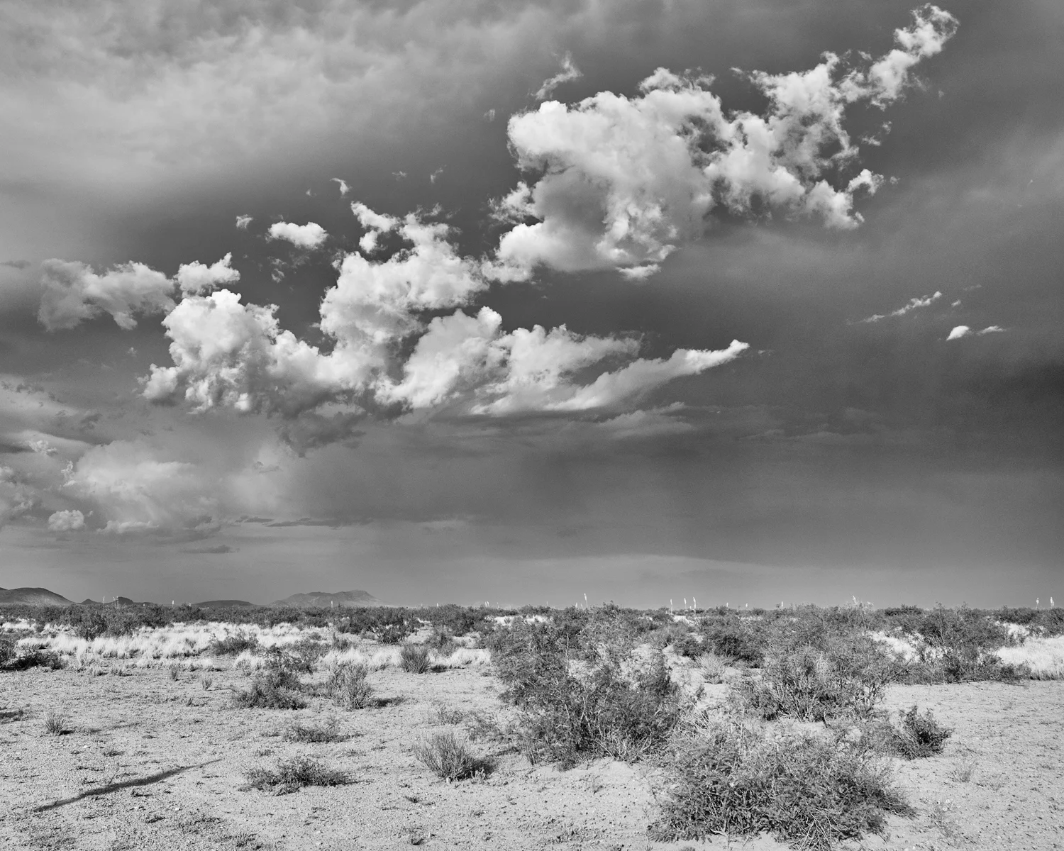
About this Photograph
This was made recently on a trip to southern New Mexico, half-way between Silver City and the Middle of Nowhere. It was one of those quick, pull over and grab the tripod and camera and run into the desert and hope not to get hit by lightning moments.
I am using this image for an upcoming Dedicated Black and White Workflow Webinar with Capture 1 Pro 8, and will discuss how the techniques discussed in this series of posts can be translated to working with Capture 1 Pro 8 Adjustment Layers.
Stay Tuned.