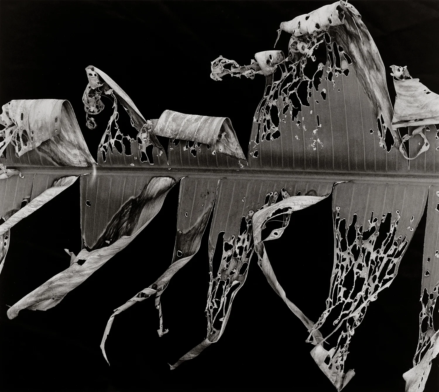
One of my "day jobs" is scanning, retouching, and designing for offset reproduction for a small photography book publisher, Lodima Press. They undertook an ambitious project in publishing a 19-volume series of the Portfolios of Brett Weston, and are about to go to press with the Volumes 11 through 14. One reason this blog has been a little light and I haven't posted any tutorials or courses is that I just finished retouching and preparing these four portfolios and three other books about to go to press, I’m now in the middle of a 135-print scanning and retouching job, and I’m starting to design two additional books that will be printed later this year. It has been/will be a busy few months, but I will try to keep the posts coming.
Example of a quadtone separation with an approximation of the ink color and final contrast
Brett, along with Edward Weston, was one of my earliest influences, and I still love his work. I visited husband and wife collectors back in 2004 and they asked, do you want to see some early Brett prints? They were from the 1910s-20 all the way through White Sands and New York and on. (One of the things I remember from those early prints is the number of spots he missed or didn't bother with...)
The first 10 volumes of the Lodima Brett Weston series were printed in Belgium by Georges Charlier, of SALTO ULBEEK, who, at the time, was doing things with quad-tone separations at an incredibly high resolution that were far beyond what anyone was doing with high speed offset lithography. Most high-end photography books were printed at a max of 300 line-screen duotone or tritone, but SALTO was able to push this to 600 line-screen quad-tone. Now, with computer-to-plate and stochastic screening, presses are capable of printing at a resolution equivalent to about 400 line-screen tritone. Some presses, like Dual Graphics in Los Angles, are able to print 400 line screen quad tone. The difficulty of printing at that resolution and with that number of separations is being able to push a lot of ink into the paper without blocking up the shadows. It takes tremendous skill on the part of the person making the separations, along with the pressman, to know what the equipment is capable of and how much to push and where to hold back.
To make the scans of the original Brett Weston Portfolios, Charlier flew to San Francisco and made high resolution scans using a large format copy camera and scanning back with settings that calibrated to his method of making the unique quad-tone separations. To continue printing the series, the publisher was forced to find a press in the United States capable of approaching the print quality of SALTO. They are working with Dual Graphics to continue the project, but that meant the original scans, originally made with SALTO's unique requirements, needed to be translated and optimized for the new printer.
The prepress department has some control when making the separations and there are some adjustments that can be made on press, but these are the final scans that they will be working with and they need to be as good as possible. The original scans with the embedded ICC camera profile were made to fit SALTO's method, they were all much too dark, and there was no way of simply converting or applying a different profile to match the original. This meant that it was now my responsibility, without having the original prints on hand, to make important aesthetic decisions about how these prints were going to be reproduced.
With all the control that Photoshop allows, it is easy to go overboard and put too much of yourself and your own aesthetic into retouching and reproducing images. The San Francisco Portfolio had to be printed twice because the first round was too open in the shadows and was not consistent with the way Brett printed. Sometimes this kind of personal involvement is needed in working directly with the artist in printing and reproducing their work, but it is on a case by case basis.
Many of the pictures in these upcoming portfolios have not been reproduced elsewhere, or if they have, to varying degrees of print quality. Dave Gardner printed a few of Brett's books, and those reproductions could be trusted, but others books were printed much too light or too contrasty. Some variations of similar prints were published previously, but editing the scans with his intention in mind really required an understanding of how Brett tended to print and his compositional concerns and themes: things like negative space, curved shapes, and how he used what we might call blocked-up shadows. Working with the publishers, who also knew Brett well personally, and with an intimate understanding of his work, these reproductions will be as identical to the originals as possible.
One of the benefits of the widespread use of digital editing and the relative ease of self publishing is that photographers now are able to create their own books. Scanning and retouching for reproduction is an art form in itself and in a future post I will show my own workflow for scanning, whether for simple web use, print on demand, or larger-run offset reproduction.
You can order the previously published books, in either a numbered hardbound collector's edition or softbound edition, as well as subscribe to the next 9 volumes here:
http://lodima.org/books/subscriptions-series/the-portfolios-of-brett-weston/
NOTE: Georges Charlier is also known for his incredible platinum prints made from five separation negatives, and along with Amana Holdings in Japan, has since developed a process of exposing the platinum coated paper directly from an image setter—doing away with the need for separation negatives. As far as I know, they are the only ones in the world capable this. http://amanasalto.com/en/


